Journal
Exploration / 6 min read
Maps of the Abyss
The deepest zones are less about navigation and more about patience, signal and interpretation.
“In the abyss, visibility becomes a privilege. The interface should behave the same way.”
Designing With Absence
The abyssal sections of Pelagea deliberately remove visual noise. There is less color, less copy and less immediate explanation.
This creates a useful tension: the user can still navigate clearly, but the emotional rhythm becomes quieter and more selective.
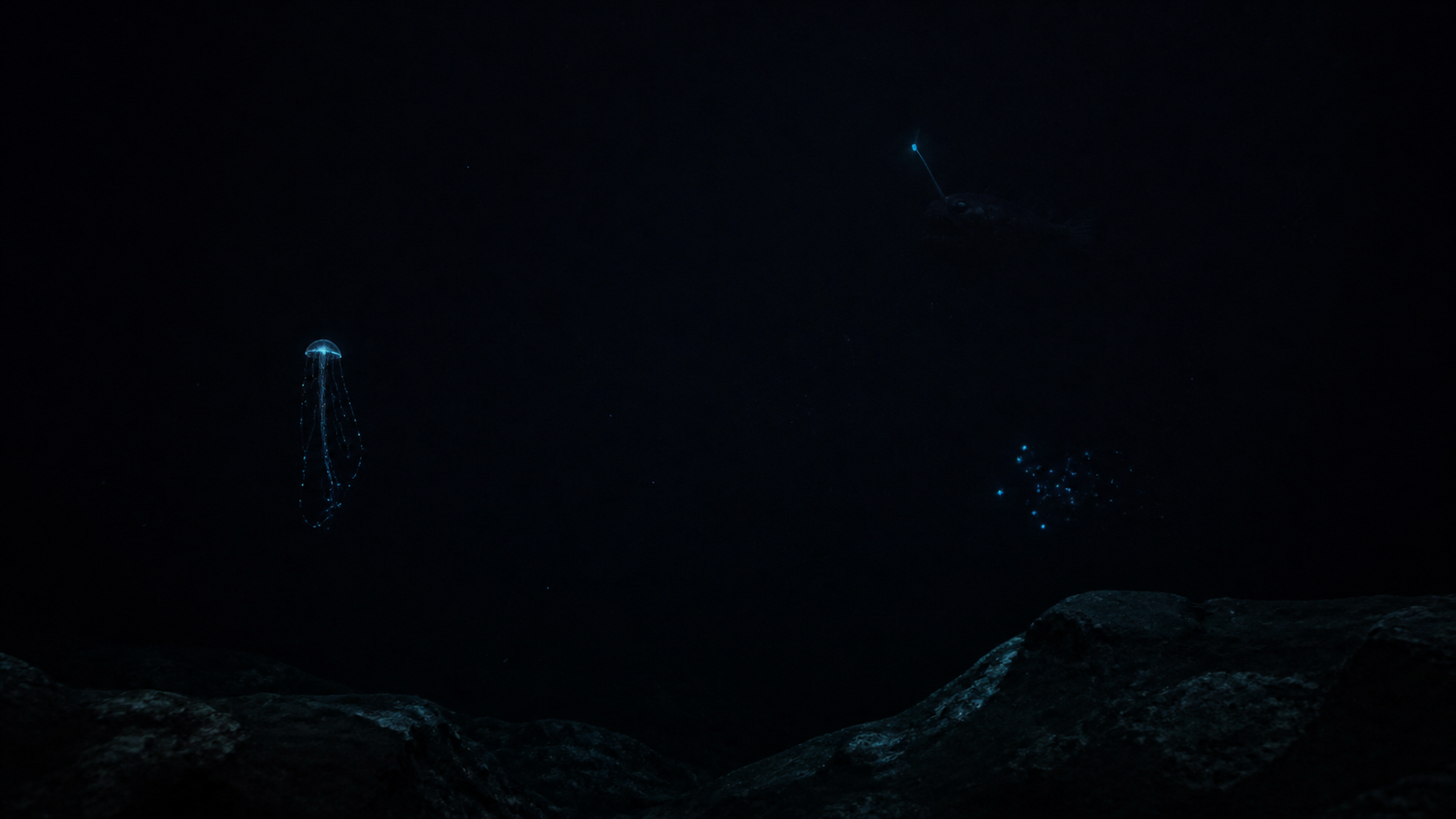
Signals in Darkness
Bioluminescence becomes a metaphor for interaction design. A small glow, used at the right moment, can guide attention better than a loud callout.
The interface earns its drama by withholding, not by adding more decoration.